May 28, 2010
Posted at 01:40 PM
Comments (28)

|
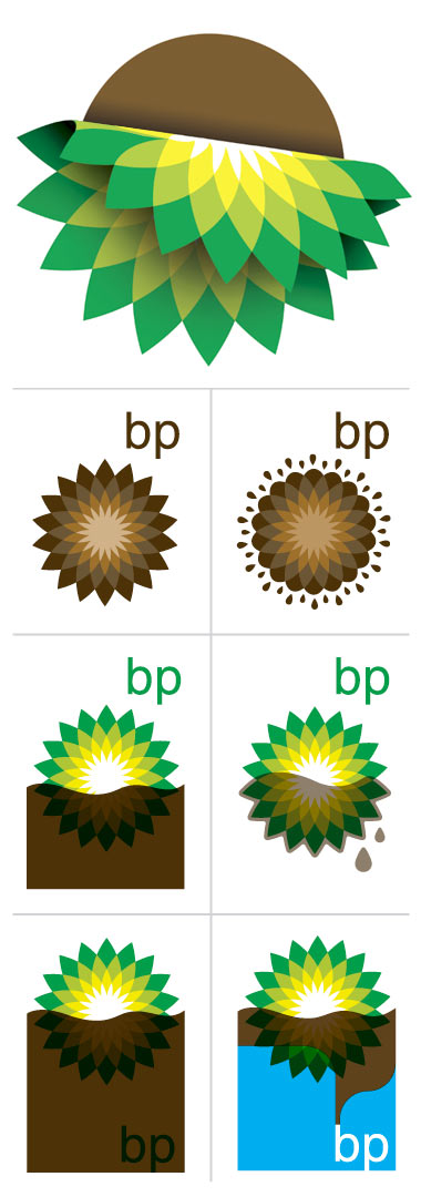
We whipped up some redesign options for the BP corporation. You know, the guys behind the catastrophe down south. Quick, obvious, dumb solutions. Here’s another idea for them: Clean up that fuckin’ Gulf! - - - - COLD, HARD FACTS: We’re busy as hell today. No time for links. Feeling wild? Go back into our DDC Archives and find some crap to check out. It’s in there. Tons of it. - - - - ON THE PLAYER: 01. Bonnie ‘Prince’ Billy - Greatest Palace Music (specifically, “Gulf Shores.”)
There Are 28 Comments
These are golden mate. They need to get it sorted quicksmart. Have a good weekend, CQ Posted by: Charlie Quirk on 05/28/10 at 1:52 PM
This is so fantastic. I like the bottom right one the best. Well done. Posted by: Mr. Diggles on 05/28/10 at 2:58 PM
Brilliant. The sad thing is, it was a great logo. Then again, so was the Swastika. Posted by: Alphonse on 05/28/10 at 3:11 PM
you go aaron, you got it so right. i am passing these icons to everyone I know. Posted by: anut mary on 05/28/10 at 3:17 PM
Brilliant, as always! Posted by: Brent on 05/28/10 at 4:49 PM
this is my fav of the BP rebranding Posted by: Duane Redfox on 05/28/10 at 4:50 PM
Here’s a link for you, a short documentary on the guys who continue the tradition of hand painting billboards in NYC Posted by: tmbrudy on 05/28/10 at 7:15 PM
Love these designs! A seriously tragic issue, communicated beautifully, and with a great sense of humour. Brilliant! ;) Posted by: Jolt on 05/29/10 at 1:12 AM
hell yeah dude. Posted by: leo on 05/29/10 at 2:05 AM
Hells yea! Posted by: Brian on 05/29/10 at 10:50 AM
Nice! Here is my own redesign: Posted by: J on 05/29/10 at 4:34 PM
“Quick, obvious, dumb solutions.” … that’s what BP is all about. And unbridled Greed. Posted by: chet on 05/29/10 at 7:13 PM
Greenpeace has been hosting a competition for logo redesigns. Here’s the entries so far: http://www.flickr.com/photos/greenpeaceuk/sets/72157623796911855/ Posted by: Pete Brook on 05/30/10 at 10:51 AM
Yea, wish Obama would help. Posted by: Julian on 06/01/10 at 8:42 AM
I guess it is not surprising that we have come up with the same idea! http://www.365tshirtdesigns.com/p/boycott-bp-until-they-clean-up.html Posted by: Alex Terry on 06/02/10 at 1:32 AM
Nice logos, but “Quick, obvious, dumb solutions”? You’d rather have a Pinky and the Brain solution that isn’t obvious at all, takes forever to implement and will fail for sure? Posted by: JB on 06/02/10 at 10:23 AM
Nice. We whipped one up last week. Slightly less refined than yours, but slightly more disgusting, too. Posted by: Woodstock Organic Concepts on 06/02/10 at 12:51 PM
Well done! Posted by: Graphic Statement on 06/02/10 at 2:37 PM
Had seen the link first on flickr, but should have known- the one’s I liked best were yours… Posted by: P on 06/02/10 at 2:40 PM
good design! Posted by: Andrew on 06/02/10 at 9:51 PM
THis is Great…post it everywhere Posted by: Jennifer Skiba on 06/03/10 at 8:34 AM
Aaron, so great! This exactly what has been on my mind… that the spill was somehow ‘karmic’ retribution for the BP logo redesign greenwash. Sure, it is one of the most beautiful logo designs in my mind, but completely misleading. Thanks for speaking our mind so succinctly! Posted by: Martin Linde on 06/03/10 at 9:58 AM
Brilliant, creative logos. I can’t look at the photos of this disaster because it makes me physically ill. Why doesn’t BP plug the hole with the freaking executives who made the mess? Posted by: teapot on 06/04/10 at 9:49 AM
Brilliant work. I would wear a t shirt of this design. especially the bottom right. Posted by: Tony on 06/04/10 at 1:09 PM
great work. Could I use this as a profile pic for facebook if I give you credit? Posted by: marta on 06/04/10 at 4:14 PM
You should submit you designs to Greenpeace’s BehindTheLogo competition: http://www.greenpeace.org.uk/behindthelogo Posted by: Wes West on 06/05/10 at 11:53 PM
simply amazing design!!! Posted by: Book of Ra on 03/27/11 at 11:26 AM
Yeah obv…looks really great :) Posted by: Book of Ra online on 04/19/11 at 5:26 AM
Post a Comment
(you may use HTML tags for style)
Remember Me?
|
| This tale best unfolds in Firefox, Chrome or Safari, man. Designed by the Draplin Design Co. |
Published daily. We guaarontee everything |
©1998-2019 Draplin Design Co. All content by Aaron James Draplin. |


