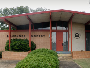
Tampa’s John Allen really knows how to ruffle our feathers. He sent the snapshots you are seeing above in a couple weeks back, and man, they really got us fired up, and in typical fashion, we sit on them, like dumbasses.
This is how telephone companies used to look. Pull up, head in, pay yer bill, back to the car, hit the road. Telephone bill out of the way. Thank you for sending these in, John. Great stuff.
- - - -
SO PROUD TO LINK THIS ONE: My buddy Eric Campbell back in Michigan has been up to some impressive work with his Tandem Design enterprise. Check out their latest triumph for a little furniture brand called “Herman Miller.” By now, we’re betting you’ve heard of them? A furniture brand that’s going places. Anyhoo, check out Tandem’s latest deal for The Nelson Basic Cabinet Series.
When I was home I saw these posters up close, hot off the press. Impressive stuff. Way proud of the work you are doing, man. Hire me when I dry up out here!
- - - -
I’LL TAKE NEW YORK ANY DAY OF THE WEEK: New York vs. Paris, graphically. I have precisely one French friend. Will prob’ly keep it that way. (Thanks, Norm!)
WHAT THINGS USED TO LOOK LIKE: And yet another painful reminder at how completely “blown to shit” hardware packaging is nowadays. I’m just gonna stop while I’m ahead on this one. Here, maybe this link at the Dieline will make you fume like it did me. It should. Stuff used to be so incredible: Vintage Packaging: Hardware Goods.(Of course, Derek Schille had a hand in this, someway, somehow. Thanks, bud.)
There Are 4 Comments
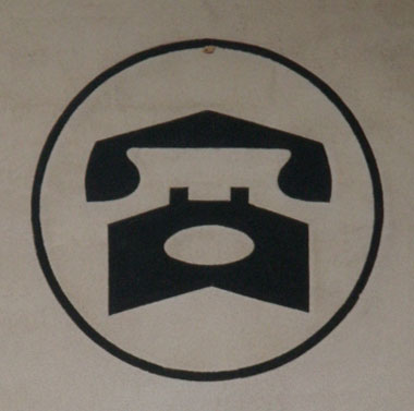
I really like how the telephone doubles as a puppy dog face.