The image above is a crop from a little something “I just couldn’t leave behind” from our “World’s Longest Yard Sale” adventure from August. We were in this little Kentucky town, in a corner gas station that had turned in a junk receptacle of sorts. Some parts of the place were fairly organized, and others, if I might be frank, completely dangerous, with no shortage of sharp things to cut eager hands “diggin’ for gold” on.
And this was one of those moments. There I was, armpit deep in this dirty box of old tools, cords, broken glass, strange pieces of metal and just plain sharp-ass-shit. It was pretty sketchy. The light was low, and I was feeling around at the bottom, and pulled this little treasure out. Some kind of packaging for a piece of tooling.
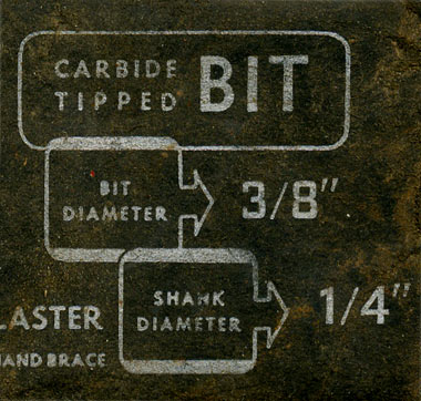
A “Carbide-Tipped Bit,” to be exact. Beautiful packaging. No bullshit. Silver ink on black paper.
This, my friends, is why we were out there. Just look at those numbers. Look at the way the “Shank Diameter” arrow outline overlaps the “Bit Diameter” outline. The kind of stuff we look for. The kind of stuff that keeps me going. Just how dad taught me.
Junk, more or less, but a little something I’ll never forget picking up out of the hell hole.
FROM HARRY IN SWEDEN: “Nanobamas.” No idea what a nanotube is, but it does sound pretty cool, and small, and scientific.
- - - -
OUT THERE, IN THE WORLD: Tons of Urban Type, from all over hell. I love links like this. It gives me faith in fact that no matter how smart the machines get, utilitarian type will always override it. Just the idea of some guy out there, working on his door, and not giving a fuck less is enough to inspire me all year long. This one has haunted me for too long: Designers think a little too much. Learn something from this stuff.
And revel in the fact, that no matter how hard you try, some guy will make this, and just blow you away.
Or this. Man. (This one was sent in by Ryan Werth, out there in the Chicago. Northern Illinois.)
Love those NYC trucks with the stick on lettering. You just don’t see that anywhere else. NY has a law that all commercial vehicles must have the company name on them even when they’re complete pieces of junk with no advertising needs.
Kinda funny how the total absence of a sense of aesthetics becomes an aesthetic in itself.
Posted by: Andrius SImutis on 02/03/09 at 11:58 AM