The DDC Factory Floor’s output came to a screeching halt yesterday at 3:20pm. Here’s why:
I got a nice email from one Cory Lorenzen, from Southern California. He bought a couple shirts awhile back and was writing in to let me know everything was working out with them. Good, good.
I do my damnedest to write every one back. Just gotta let them know their order was sent out. or to say thanks. or that their good words meant a lot to me. Stuff like that. So this time around, I wrote the guy back, checked out his work, freaked out, and then just cold-called the guy with a list of questions and comments. That’s just how you have to do it sometimes.
Turns out Cory is one of the guys who I have been wondering about for years. One of the guys, who, quite frankly, can make or break a movie for me. He’s a Production Designer who’s worked on films like Napoleon Dynamite, Fanboys and Greek.
He’s the guy who makes the call on what you see in the backgrounds. And that means all of it. The set. The posters. The props. Hell, right down to a Mountain Dew can. And of course, my eagle eye, and all micro-judgements that are attached to it, go right to the things that stick out in that set:
- Hey, that font wasn’t created yet in that time period.
- The kerning between “K” and “O” is way too loose.
- Those jeans are from a couple summers ago. This is supposed to be 1994.
- No one’s closet looks like that.
- People didn’t dress like that in the ’70s.
- “Rock Crowds” don’t look like that! Or cheer like that!
Shit like that. My dilemma. My problem.
But Cory took on my questions with a professionalism and candor that put me at ease pretty quick. On a Sunday, even. Many, many thanks. Life’s just too short to keep quiet on this stuff. I have to know what it’s like to make the calls in the background. Here’s some of the stuff I needed to hear:
- They work under incredible time constraints.
- Lawyers vett everything. Everything. So you gotta be careful.
- Sometimes shit falls through the cracks.
- Fonts: More thorough the license, easier to use.
- Props are made very, very fast.
- The average viewer would never notice the micro bullshit I hang on.
And yeah, I kinda got this already, but it was cool to hear it from a real human. Of course, I have to step back and ask myself, “Who the hell do you think you are?” Some kind of critic? Some kind of authority? No, not in the least. Just a fan who appreciates artisans who consider the details. That’s all. Skewer me if I am out of line.
I mean, I almost walked out of There Will Be Blood due to bad kerning in the opening titles. I mean, I just expected so much with that one, and not a minute into it, I spotted lazy typography. It got my goat. I’m glad I stuck around because I fucking LOVED that movie. So gritty. So good. Great color and sets and dirt and sweat and sadness and desperation. Intense.
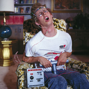
I mean, come on, this is the guy that built the time machine in Napolean Dynamite. So good.
I’ve always wondered about these guys. What a cool fucking job. One question though, by more thorough license for fonts, did he mean a longer more complex license? I always figured the simpler the font license, the more likely someone to use it.
Thanks for this post. I’m a film guy too and work with a number of fantastic graphic peeps who are INSANELY anal about fonts. So much so I have to pull the plug on them occasionally or else there would be nothing on the screen rather then a font/layup which we know isn’t quite correct for the period, but to the layman, works.
There is never enough time, and on period pieces things do fall through the cracks occasionally. It’s quite hard to be vigilant and don’t get me started on fighting with producers about why we need to spend money buying fonts when you can ‘get them off the internet’…
That being said the biggest bee in my bonnet are period newspapers, actually any newspaper. There are so many I’ve seen that look like shit. It really makes me crazy.
You might have seen this from a couple years back… http://www.nytimes.com/2006/01/01/movies/01edidin.html
it’s a good read.
I love the criticism that goes into graphic design / type elements on film, it keeps you honest and well it’s nice to know that it fucking matters…
Oh and BTW film titles are a bit of a different animal, that’s not usually the production designers fault!
keep up the good fight.