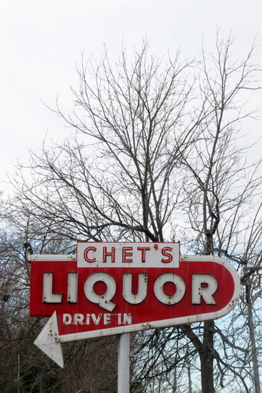
WOW: Derek Schille sent in the image above. He added this in the transmission: “Saw this sign at in an area I must have driven through a thousand times. Don’t know how I missed this before. Interstate 35E and State Highway 13 in St. Paul.”
Nothing like a cold day in Minnesota, and a liquor store filled with millions of drops and drops of possibility.
- - - -
DOING THE “SPOT UV” STUFF RIGHT NOW: Just about wrapped with the Union catalog. Too busy to dig anything else up. Seeing light at the end of the tunnel, though.
There Are 4 Comments
Hey! That’s right by my house. In fact, I picked up a 12-pack of Red Stripe from Chet’s that I’m drinking while I type!
Want to know an interesting fact about this sign? The liquor store is pretty new and independently run. Somebody made a design decision to either preserve a vintage sign, or go through the trouble of recreating a mid-20th century iconic typeface.