|
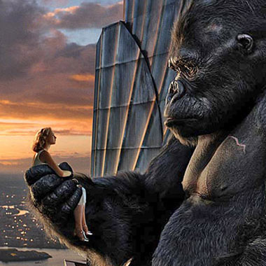
“Worth the goddamned nine bucks.” -A. Draplin, DDC, Shift Foreman “No ‘monkey business’ going on in this one.” -Nicole Kass, Grenade Gloves, Common Sense Dept. “A real thrillride!” -Matt Kass, Grenade Gloves, Giant Stomach for Risk “He (Kong) had a hard life.” -Jeff Baker, Snowboard Magazine, Editor - - - - But of course, I have a couple gripes. I’m sure some Art Director will win a grillion awards for the set design, I mean, it is inevitable with a movie of this magnitude. But one thing that kills me, over and over again, is the lack of respect for typefaces and their time periods. Max Miedinger’s Helvetica Bold Condensed was not around in 1930. Not until 1951. He’d roll over in his grave. What the movie needed more of, with those amazing city streets shots was, Renner’s “Futura Bold,” Hoefler’s “Gotham” and Anderson’s “Stratum.” They would have fit more. To the set designers: “Rookie moves, you fuckers.” There Are 4 Comments
haha, well said… the same issues were with gangs of new york, but thanks for the review, i will have to check this movie out soon… Posted by: ike on 12/18/05 at 6:44 AM
I thought they should have ended it on Skull island. That NY stuff… ugh, just too long, and with too much sadness. Movies don’t have to clock in at 3 hours in order to win an Oscar, Mr. Jackson. Posted by: Kurt Halsey on 12/18/05 at 8:21 AM
you are such a font snob Posted by: coyle on 12/19/05 at 1:32 PM
Aaron, Posted by: Aunt Mary on 12/22/05 at 6:59 AM
Post a Comment
(you may use HTML tags for style)
Remember Me?
|
