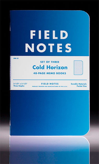
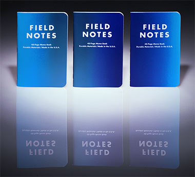
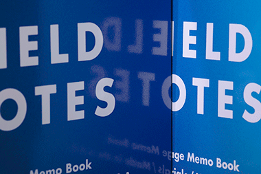
WE CAN FEEL THAT “COLD SNAP” COMING ON: Our 21st offering from Field Notes! This time, we’re riffin’ on those cold winter blues! The threepack is a set of blue gradient covers, three different shades of blue innards, ultra-glossy covers and light gray graph grid lines. Cool to the touch.
From the a href=”http://fieldnotesbrand.com”>Field Notes! website: “…invoking the deeply saturated winter twilight sky, fluorescent glacial water, and the shiny metallic glimmer of the Aurora Borealis.”
Now, if you go back through our limited edition offerings, you’ll notice a range of colors, styles and printing techniques. This time around, we’re going after blue, and our little line expands into new hues and tones. Love it. Can’t wait to get my stash of them!
REQUIRED VIEWING: Here’s a list of “winter preparedness tips” in that “Field Notes way” you’ve grown to love, and hell, we live by. Another KILLER job by Field Notes Midwest. Just incredible. Makes me miss that Midwest. And winter!
Get ready for winter with our new “Cold Horizon” edition! Blue as it gets. Brrr!