May 31, 2011
Posted at 12:10 PM
Comments (3)

|
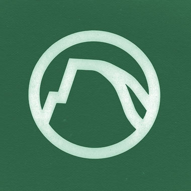
WHAT A WAY TO START OFF THIS WEEK: Cory Lorenzen comes in real hot with this INCREDIBLE Yosemite Park logo. Last I visited the park was in 1995, passing through. Too fast. This logo says two things very clearly: 01. I’m awesome. Plans are in the works. Thanks, man. Always appreciated. - - - - FROM THOSE TWIN CITIES: Jason Miller sent this one in just moments ago: The Art of Minnesota Brew. We made our way to this link and got a little tipsy on the graphic goodness therein. Thanks, buster. Hope shit’s good for you back there. - - - - WE DID AN INTERVIEW AWHILE BACK, AND FUCK, WE TALK A LOT: Here’s a little interview with Project Galvanize! Thank you for believing in the DDC, Brian Beavers! - - - - ON THE PLAYER: 01. Centro-Matic - Candidate Waltz
There Are 3 Comments
Easily my favorite National Park logo. Wish they’d put it on a tshirt. Or that they wouldn’t get upset with me for removing a mile marker. Yosemite is one of the few parks that does a decent job with branding. Posted by: twoeightnine on 05/31/11 at 7:08 PM
you should put that on a shirt yourself - that design would be a simple screen print job Posted by: Martin Beran on 06/09/11 at 10:21 AM
Just saw this sweet matchbook with the Yosemite logo. Posted by: Lonny Hurley on 06/13/11 at 2:00 PM
Post a Comment
(you may use HTML tags for style)
Remember Me?
|
| This tale best unfolds in Firefox, Chrome or Safari, man. Designed by the Draplin Design Co. |
Published daily. We guaarontee everything |
©1998-2019 Draplin Design Co. All content by Aaron James Draplin. |