January 01, 2011
Posted at 09:34 PM
Comments (2)

|
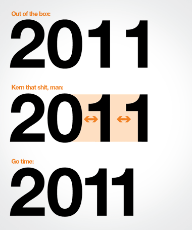
FEELING ENTHUSIASTIC: It’s a new year and we’re gonna fight hard to make it a good one. Here’s a resolution for ya: “Less time on frivolous shit.” Less news. Less Twitter. Less carrot-on-a-stick pursuits. Less flash-in-a-pan designables. Less dumb. Less stuff that you’d forget a minute later. More movement. More people. More adventure. More chill. It’s a new year. I like writing that. Lots of cool shit can happen. Feeling thankful for a good 2010, and feeling optimistic about pushing into 2011. Enthusiasm for life! - - - - AND: You better watch that kerning of 2011! Mark Weaver warned you about this too! He’s got the eye. Learn something here! Out of the box, that 2011 is an ugly thing, so watch how the 20 connects to the 11! All year long. Kern it up. Go.
There Are 2 Comments
Haha, first thing I noticed when designing something for a save the date for this year, no matter what font I chose, that 2011 looks like garbage when it isn’t kerned properly. I always enjoy the tone of your posts. Sorry I don’t comment more, I’m an RSS reader so I don’t usually get to the site to read the posts. Thanks, and I agree, kern that shit, man. Posted by: Timothy on 01/24/11 at 6:20 AM
hitting, nail, and head come to mind. How much brand review is needed to do anything these days? Use your noggin. Posted by: Zoe Alsop on 04/06/15 at 5:20 AM
Post a Comment
(you may use HTML tags for style)
Remember Me?
|
| This tale best unfolds in Firefox, Chrome or Safari, man. Designed by the Draplin Design Co. |
Published daily. We guaarontee everything |
©1998-2019 Draplin Design Co. All content by Aaron James Draplin. |