May 15, 2009
Posted at 04:28 PM
Comments (20)

|
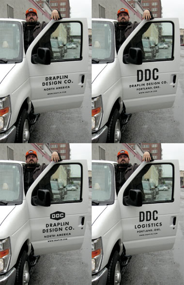
It’s Friday, and “Van Week” on the DDC factory floor has run its course. Many thanks to all the badasses who wrote in and offered up good advice, signage tips or general well wishing. Means a lot to me. Always does. All in good fun, you know? I’ll be getting my plates and tags on Monday, and after that, well, just watch yer back on that open road. What yer seeing above are the final four contenders for the fleet graphic. Just the facts! And here’s some that were scraped up off the factory floor and thrown into a little image. Not ruling anything out, just yet. It’s been an incredible goddamn week. - Got a mountain of stuff done for the clients. - - - - BEST THING GOING IN LOS ANGELES JUST HAPPENS TO BE FROM OREGON: And how about that? Portland buddies Adam Haynes, Seth Neefus and Tim Karpinski are taking on Los Angeles pretty fiercely. Well, wait. Pinksi is still on probation with the DDC. That little shit. Here’s their show: “Greetings from Oregon - Hello Los Angeles” Anyhoo, they are doing some cool things. I can’t say I know Jason Manley, but man, his stuff is great too. Damn. Way to work, fellas! - - - - BEEN HERE BEFORE BUT KEEP ON COMING BACK: Gavin Potenza’s beautiful “Homage To The Stamp.” Another way to look at ‘em here, too. As well as his, “Stamps Of The World.” Man, pretty serious. Blown away each time I see them. I want to make some stamps. I got a quote a couple years back and it jarred me pretty good, so I had to put ‘em on hold. Soemday. Something to think about from Mr. Potenza. Well done. - - - - FROM POWERS, DOWN IN THE BAY AREA: “The 40th Annual New England Gypsy Tour” program cover from Laconia, New Hampshire. This one is for Dabica, of course. Hope you dig it, brother! - - - - WE NEVER KNEW FORGASH HAD A SIBLING: Ya learn something every day. I know you’ve seen it, but no one tells me shit and Dale looked over at me this morning, with a line of drool hanging off his lip and said, “You gotta see Awkward Family Photos.” So I went and checked it out, and don’t think I can eat any lunch now, for whatever reason. - - - - LET THIS ONE BRING “VAN WEEK” ON THE DDC FACTORY FLOOR TO A CLOSE: One more singage option. - - - - ON THE PLAYER TODAY: 01. Wilco - Wilco (The Album)
There Are 20 Comments
Bottom-left is my vote. The logo is classic. Or vcr repair. Posted by: Peter Baker on 05/15/09 at 4:37 PM
I enjoy the bottom left version. Also the Dachshund Reproduction Society. :D Posted by: Geoff on 05/15/09 at 5:20 PM
Bottom left. Bingo Bango Bongo. - Bone Posted by: Brady Bone on 05/15/09 at 5:40 PM
The one in the lower left-hand corner is it. Posted by: Jeff on 05/15/09 at 5:52 PM
bottom left corner. Posted by: Chris Wilmoth on 05/15/09 at 5:55 PM
Top right is a classic (still have that tee). Though I also like the bottom right as well. DDC, Trade Gothic Condensed No. 20. Yes. Posted by: Naz Hamid on 05/15/09 at 6:02 PM
Bottom left hands down. And by the way, verm.? Come on, you can’t abbreviate VERMONT! Posted by: White Bear on 05/15/09 at 6:46 PM
Bottom left hands down. And by the way, verm.? Come on, you can’t abbreviate VERMONT unless it’s VT! Posted by: White Bear on 05/15/09 at 6:46 PM
bottom left. Posted by: gage villere on 05/15/09 at 7:28 PM
Put me down for the bottom left, too. Posted by: Robert on 05/15/09 at 7:31 PM
Do your graphics on the main body of the van (love the large orange logo), and save the doors for a fuckin’ truck lettering master. Futura and Trade Gothic are great, but yawn. How many times do you have a goddamn new van to decorate? You could go two routes here, crazy- ass, anything-goes NYC-style: http://www.pjchmiel.com/feat/nyc05/pictures/209-0971_img.html or honest-to-goodness “truck lettering” (a dying art), if you can still find someone who does it within a thousand miles of you: http://www.pjchmiel.com/feat/dakota02/pictures/eureka,sd.html Loved the energy drink graphics, sad but true, great execution. Posted by: PJ Chmiel on 05/15/09 at 7:39 PM
I’m a lemming - I vote bottom left as well. Posted by: Amber on 05/16/09 at 8:08 AM
Bottom left. I love the logo! Posted by: Beth on 05/16/09 at 10:59 AM
congrats!!! you need a van number top right Posted by: keegan on 05/16/09 at 11:18 AM
Eeeesh. This is a hard one. I’m going upper right. Posted by: Cory on 05/16/09 at 11:51 PM
Bottom left, no doubt. Posted by: Justin Sirois on 05/18/09 at 7:25 AM
Bottom left. But I think DDC orange for the van and black text. Not a minimal as black on white but 100% classic DDC style. Posted by: Cameron Barrett on 05/18/09 at 10:21 AM
bottom left. slayer hippy school of pharmacay. feel the darkness. Posted by: frank on 05/18/09 at 10:26 AM
bottom left. slayer hippy school of pharmacy. feel the darkness. Posted by: frank on 05/18/09 at 10:26 AM
Chalk me up for the bottom left as well! Posted by: Rob on 05/19/09 at 10:37 AM
Post a Comment
(you may use HTML tags for style)
Remember Me?
|
| This tale best unfolds in Firefox, Chrome or Safari, man. Designed by the Draplin Design Co. |
Published daily. We guaarontee everything |
©1998-2019 Draplin Design Co. All content by Aaron James Draplin. |