May 14, 2009
Posted at 01:32 PM
Comments (20)

|
May 14, 2009
Posted at 01:32 PM
Comments (20)
|
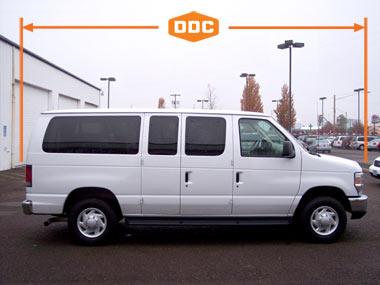
We’ve been talking a pretty big game about graphics for the new rig. And since this quest started, I’ve had a million ideas cross the thinker. So many possibilities. Some grand, some not-so-grand and some downright dumb as dirt. Here’s some of the progress along the way: Dip the thing in gray, and put a DDC logo on it. 01. “Make the logo bigger, man.” Or dip it in orange? 02. “Northlock type and Pantone 165.” Just why are we doing this, anyway? To go out and drive across the land, and live out of this thing, right? Yeah, that’s the ticket. 03. “500,000 miles, here we come.” Or we could go out and service the proud retailers of Field Notes? You know, tidying up stacks of memo books and lining up pencils and stuff? Get myself a little suit? Body by Sears Big and Tall. Drove past Crate & Barrel on the way up from Albany, and thought about those cool bags carried by desperate housewives… Then we got to feeling patriotic, as we often do, and got out some red and royal blue and went soaring with the eagles… 06. “Bicentennial Beast.” We can always use more color, you know? Just a thought. Looking at our roots, we went with our forefather… 10. “Dad Wrap No. 01.” We’re always down with woodgrain. 13. “Good wood.” Long dog? Long van. 14. “Gary, get in the van!”
Watt called his rig “The Boat.” Schooner sounds good, too. This one is for Jona from the Yacht family of quality brands… And of course, we had to go after the current “energy drink craze” sweeping the nation and killing stomachs linings from motocross tracks to backyard wrestling shindigs… 16. “The snappiest name I could come up with.” Here’s one last idea for this whole deal… But of course, this is where I’ve been leaning since I started this quest… …and here’s why: I want to blend in with the produce trucks up the block, you know? Last thing I’d want is to be some target for vandals or a reason to break into. So it’ll either say, “Draplin Design Co.” or “Draplin Plumbing” or “DDC Logistics.” It’ll say something, and you won’t even notice the thing. And that’s what we’re gunnin’ for. - - - - DAYWRECKER WARNING: Daily Bungalow. House and home sentimentalists, be careful in this one. Man. Could mess you up pretty bad. “The War Years and Beyond - The 1940s” and “Historic Exterior Color Schemes for Your Bungalow.” My Craftsman was built in 1925 and I love it. Good, little house. The story goes you’d buy the kit from DSears, and they’d drop off a number of boxes on your front lawn. If you had the loot, you’d hire someone to build. If not, you’d roll up yer sleeves and get to work. What a thought. Such a different time. I’m lucky to “screw in a lightbulb,” and that shit’s sad as hell. I’m working my way up to “installing coat hooks.” - - - - MORE NATURE: Imagine punching in at this “nature pod” each day. Pretty incredible. All the way over in Spain. - - - - FROM FRANCE: This one was sent in by Susan from Coudal Partners. And here you go: An amazing “PTT” logo that’s some kind French Utility or something. And here’s what we had to say to her, “It’s just amazing how something cast in metal can bring something to life in such a “this isn’t going anyhwere, ever” kind of way.” Hell yes. Beautiful. You just can’t mess with things cast into metal. - - - - ON THE PLAYER TODAY: 01. Wilco - Wilco (The Album) (You rats better buy two copies when it comes out! I sure will be. Wow.) There Are 20 Comments
#1 or #14 I too love vans! i used to do a zine when i was a kid called Punk Vans. I should do resurrect it. Posted by: frank on 05/14/09 at 1:38 PM
Christ man! Guess who’s going to be driving me and my 2-man crew around the country making filming our tv show? Posted by: Pablo's Nachos on 05/14/09 at 2:26 PM
If you’re going for vandal-protection, I think “Just make it like my shirt” would be the safest option ;) In all seriousness though, #18 with the DDC logo below would make for a kick-ass van. Whatever happens, can’t wait to see the results. Posted by: Harley Turan on 05/14/09 at 2:33 PM
They are all awesome in their own special way. I loves me No. 01 and No. 18. Posted by: Patrick on 05/14/09 at 2:36 PM
isnt it obvious. do the rugby shirt colors. its by far my favorite. -chris Posted by: Chris Wilmoth on 05/14/09 at 2:56 PM
fwiw: 01. gray/big logo Posted by: Ray Massie on 05/14/09 at 3:26 PM
I got 5 on #18. Fuck-flavored Assholz was a close second, though. Real close. Posted by: Tim Lahan on 05/14/09 at 4:55 PM
I like the plain white look (#18), but how about adding an orange DDC logo on the roof, so we can look for you out on the road using Google Maps? Posted by: Chris Murphy on 05/14/09 at 8:41 PM
Before even reading the post I was definitely thinking rugby shirt! But in all honesty I would go with 18 or 1, but with the logo sized for just the final window/quarterpanel section or a variation on the two. Posted by: Lemon on 05/14/09 at 9:55 PM
Congratulations on the new van, Aaron! You sure picked up a beauty. Here’s to many happy trails ahead. I love #1 and #18. How about #1, DDC grey, with a smaller logo under the type on the front door? Sweet! Posted by: Beth on 05/14/09 at 11:39 PM
i go number 1 or good wood Posted by: martino Fumagalli on 05/15/09 at 12:21 AM
#1 or #18 or #18-B (gray body version) If you go #18 don’t say PLUMBING. People be breaking into vans and construction sites for copper these days. Have to say I’d kill to see a van advertising Fuck-Flavored Assholz driving around here in Charlotte. Be Good. - Bone Posted by: Brady Bone on 05/15/09 at 7:11 AM
I think number 1 or 18 are sweet and simple. But either way, you gotta put the DDC orange logo block reverse on the front like an ambulance. Posted by: Andrei Pasternak on 05/15/09 at 9:03 AM
Number 11. “Dad number 2” . That would be the most bad ass van ever to hit the asphalt. Posted by: max on 05/15/09 at 11:02 AM
#1, #3, #6, #9, 13 Any of those would be kick-ass! Can’t wait to see which one you go with. Posted by: Mike Kirkpatrick on 05/15/09 at 11:22 AM
I really like #18 too, but I think you’d be better suited with this route: Posted by: Kyle Turman on 05/15/09 at 11:45 AM
Here comes the bright orange DDC mobile unit, rescuing the best of America’s forgotten junk from your garages and attics. I fully expect a 30,000 sq. foot DDC Americana Memorabilia Museum of Long-Forgotten Junk in Traverse City, MI in about 15 years. I’d pay $5 to get in, for sure. Posted by: Cameron Barrett on 05/15/09 at 12:16 PM
What Bone said. 1, 18-B (grey or black). I love Dad Wrap 2. I also like Beth and Andrei’s ideas. Best, Posted by: Rebecca on 05/15/09 at 12:24 PM
Hmmm… how to incorporate all of them? Maybe like a mural harkening back to Cheech’s Aztec warrior paint job. Can’t remember which movie that was. Also ike the ambo style logo mentioned above. “Fuck - flavor”? A must. Had me cry-laughing. Posted by: tyler on 05/15/09 at 12:38 PM
#12 Dad’s shirt is a must with the DDC open Road logo reversed out, honor the history and the ol’ man! Posted by: Andy on 05/15/09 at 1:08 PM
Post a Comment
(you may use HTML tags for style)
Remember Me?
|
| This tale best unfolds in Firefox, Chrome or Safari, man. Designed by the Draplin Design Co. |
Published daily. We guaarontee everything |
©1998-2019 Draplin Design Co. All content by Aaron James Draplin. |