|
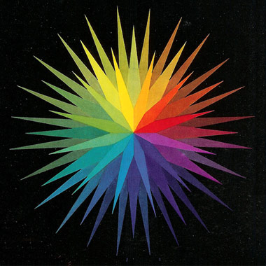
The colorful explosion above falls into my “Needing More Color In My Life, And Finding It” category. It’s from an old “Gossen Erlangen Sixticolor” catalog cover or something from back in the day, and it was dug up by the one and only Eric Baker for his daily blast of inspiration images. You can find the same blast on Design Observer too. So in a sense, I’m just passin’ on a little color to y’all. There you go. It’s Friday. Let’s get to work and make something awesome. - - - - GOING DOWN RIGHT NOW: Layer Tennis over at Coudal Partners! - - - - GOING DOWN TOMORROW NIGHT: Cut & Paste Portland at the Art Museum downtown! Got to meet my fellow judges last night. Cool kids from all kinds of cool jobs and backgrounds around town. Pretty excited. See you there. - - - - ONE OF MY FAVORITE LOGOS OF ALL TIME: That Maersk logo and the story behind it. Required reading. Great color, type and hell, anything on the side of a shipping container or supertanker is pretty cool in my book. - - - - ON THE PLAYER TODAY: Unwound’s first four albums. And loud. - - - - JUST ABOUT THE BEST THING I’VE SEEN ALL WEEK: A “CN Rail Drink Coaster.” Bottoms up! - - - - THIS ONE, JUST IN FROM KURT: “Bad Paintings of Obama.” May God Bless this great country, and all artisans in it. And to whoever painted this one, well, the whole DDC factory floor salutes you. There Are 4 Comments
sweet links Posted by: Talizmatik on 03/06/09 at 2:21 PM
oooo beautiful. I love the dust speckles too. Looks like Kal-El’s starship in space. Posted by: Kyle on 03/06/09 at 3:08 PM
I agree with your fav Obama painting, but for my $$$ I’m going to go with the underpants/taco themed doozie! Posted by: Hottois on 03/06/09 at 6:09 PM
wow very nice post thanks!!! Posted by: Crystal on 04/05/09 at 3:46 PM
Post a Comment
(you may use HTML tags for style)
Remember Me?
|


