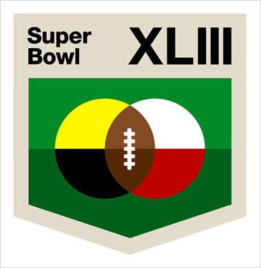
OUR FIRST TIME IN “THE NEW YORK TIMES”: So all my buddies got to go out late last night here in Vegas. You know, whoopin’ it up, sluggin’ back libations, etc. Not me. I was locked in my room making a logo.
And hey, it’s pretty fascinating how the “overlapping things to make a football shape” came up so much. That’s the first thing that popped into my thinker, and I let it rip. Awesome how this stuff works, you know? Please call again, NYT!
- - - -
SO MUCH TO CHECK OUT: I got to see all kinds of incredible work today at the trade show.
- The “Indoor Survival” board for Capita. So good.
- Nitro’s shit is alway incredible, and Paul Brown’s graphic contribution is gigantically noted. Serious lines, serious lines.
- Cody Hudson’s stuff for Forum.
- Tyler Stout’s Youngblood series for Forum.
- The “Slackcountry” series for Ride. Best topsheets of the day.
I love getting to see all the new work, and especially, the stuff from friends. So many talented fuckers getting it done.
Had a challenging supper with Rose, Lance and Michaylira at some weird Japanese place a couple miles off the strip. One of Rose’s so-called “Finds.” You should seen the “pile of octopus” those fucks ate. No way. Never. I had pot stickers, jalapeno fried rice, some failed “baked potato with bacon stir fry” and one bite of crusty mackerel. Should just went to In-n-Out.
I KNOW YOU TURDS ARE READING THIS SHIT: A special, hairy, top-of-our-lungs, “Bite it!” goes out to Evan Rose and Lance Violette, high above the rest of piss ants, spooning in their Mandalay Bay penthouse. You know, you can dress ‘em up, but you….
There Are 20 Comments
Interesting how a few of the other designers picked up on the whole fooball/Venn diagram thing.
Congrats on the NY Times appearance. Your logo is pretty sweet.
It makes me wish that the NFL would actually wait until the teams have been decided before they make a logo, so that they could tailor the colors to the team’s uniforms.
I first came across the New York Times article and was going through the other logos and came to this one. Hands down, yours is the best! I was happy to see that it was by you guys! I love the simplicity.
I have to say that I really like this design…clean, simple and not full of extra stuff that will distract you…this is perfect for the current economic times…Almost like the Pathmark-No-Frills version of the SuperBowl…
Sorry for leaving you this message here, but I was unable to find an email address for your editor.
I wanted to tell you we’ve been featuring your content on ActionSportsBlips.com. It’s actually become one of our highest viewed sections. You can see for yourself here: http://actionsportsblips.dailyradar.com/blog/draplin_design_co/
Please email me if you have any questions.
Awesome, man. You have that uncanny ability to distill it down to its most simple form�€”a hallmark of the world’s best designers. I vote your creation and Felix Sockwell’s as the standouts. Cool opportunity.
You people need to quite telling lies to whoever designed this logo. This logo is pretty awefull!!! Have you all not seen the beautiful current superbowl logo? I mean, come on! hell-o!