January 05, 2009
Posted at 11:13 PM
Comments (2)

|
January 05, 2009
Posted at 11:13 PM
Comments (2)
|
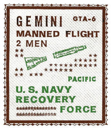
GONNA BE A GOOD 2009: An incredible collection of space “First Day Covers.” - - - - MR. CRUZ UPDATES: Quality Vintage updates and man, there’s lots of good stuff to check out. Get over there and bookmark that sucker, and learn a thing or two. This right here is why I’ll be coming back for more and more. One hell of an eye for the good stuff out there. - - - - ABOUT TIME THEY GET IT RIGHT: The Good Housekeeping seal goes back to basics, and we feel pretty good about it. Thank you. (And thank you to Robert “Rocky Mountain High” Brandin out there in Golden. He sent this in, and we’re glad to know the guy.)
There Are 2 Comments
have you seen this collection of vintage washing machines yet? http://automaticwasher.org/COLLECTIONS.htm crazy! Posted by: ward on 01/09/09 at 4:21 AM
You like the new design. So do I. “From a graphic design perspective, the new logo is amateurish and does not convey any sense of what the seal is supposed to convey. The font choice is poor as the drooping type indicates insecurity. The inner thin line within the outer darker line suggest insularity and defensiveness.” Posted by: Case on 01/09/09 at 2:11 PM
Post a Comment
(you may use HTML tags for style)
Remember Me?
|
| This tale best unfolds in Firefox, Chrome or Safari, man. Designed by the Draplin Design Co. |
Published daily. We guaarontee everything |
©1998-2019 Draplin Design Co. All content by Aaron James Draplin. |