January 14, 2009
Posted at 03:33 PM
Comments (5)

|
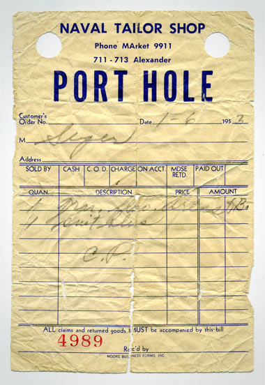
My little sister Leah is romantically involved with a good lad by the named of Jacobus. He goes by “Jacob” for the most part, but I can’t help but feeling real “Matrix”-ish or slightly “Secret of Nimh”-ish when I hear it all sounded out. He’s good to my sister, so we’re on good terms. He’s got some cool tattoos, and he’s from Jackson, Michigan and from what I hear, he’s lethal on the Wii. Pretty good mix. Anyhoo, he bought an old Navy peacoat, and the incredible “Port Hole” receipt you are seeing above is what he found in the pocket after some minimal inspection. This is exactly the kind of stuff that I like to think about. The idea that this receipt was in that pocket for some 50 years or something, all folded up and forgotten. For generations. Incredible. And Jacob found the thing. Well, that coat is getting put to good use again, and I’m the proud owner of a JPEG scan of the receipt. He wouldn’t give ,e the original, so, I might have to leverage “family excommunication” or something to get my dirty hands on the piece of paper. I’ll draw up some sort of scheme. - - - - THE ONLY “ROCK REUNION” WORTH A SHIT: The goddamned Jesus Lizard get back together for 2009 shows, an are rehearsing in Nashville. Very, very happy about this. David Wm. Sims mans the low end, and man, I am a fan of those line. (All of this, and so much more, overheard at Chunklet.com. Yeah, those pricks.) - - - - WELCOME TO THE FUTURE: The Lizard gets their own Myspace page. How about that? - - - - LOTS AND LOTS OF PILE UP: Things are always cookin’ over at So Much Pile Up. Lots ot see over there. Here’s one for Ryno, that Nordic bastard. - - - - IN A HOTEL ROOM SOMEWHERE: Kurt Wagner of Lambchop, all by himself. “Slipped, dissolved and loosed” is the song. Off his latest. We’re gonna see him here in Portland in early March. Pretty excited about that one. (Mined off Leigh’s site.)
There Are 5 Comments
I love it. But I think sometimes we designers get a bit too nostalgic. Is this really crap, and only cool because it’s *old* crap? What’s with the capital “A” in MArket? How about that giant word spacing? My theory is that we are bipolar: we worship ordinary, unselfconscious design, but we also worship high design. We move to gritty urban neighbourhoods for their greasy spoon restaurants, but we also go gaga when a French bistro moves in. Speaking entirely for myself. Posted by: jeckenzibbel on 01/14/09 at 4:04 PM
The Big A in “MArket” denotes that is a memory peg- a word to make it easier to remember the phone number. The first two letter of market are the first two digits of the phone number (ie 6 and 2). It made phone numbers easier to remember. See also:”PEnnsylvania 6-5000”. Another way of looking at artifacts like this is that American history is written in the forgotten banal details. Just sayin’. Posted by: frank on 01/16/09 at 8:08 AM
I love the “MArket”. It’s sorta the zen of the imperfect being part of the perfect. Posted by: noisyspoon on 01/16/09 at 6:25 PM
Everyone else already said it, but I like the capital “A” in ‘Market’ too. At first, I read it like he bought an Old Navy peacoat instead of an old Navy peacoat. Posted by: Markus on 01/28/09 at 2:17 PM
Awesome story here! I love history and I’m always trying to learn something new in the field. Thanks Posted by: John history lover on 11/04/14 at 3:29 PM
Post a Comment
(you may use HTML tags for style)
Remember Me?
|
| This tale best unfolds in Firefox, Chrome or Safari, man. Designed by the Draplin Design Co. |
Published daily. We guaarontee everything |
©1998-2019 Draplin Design Co. All content by Aaron James Draplin. |