April 19, 2007
Posted at 09:57 PM
Comments (3)

|
April 19, 2007
Posted at 09:57 PM
Comments (3)
|
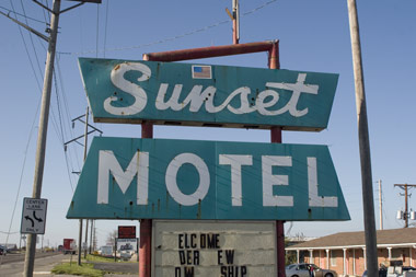
Left the Super 7 Inn this morning at the crack of 10am. Got out on I-70 and headed due west toward Kansas City, veering southwest about 80 miles out, down towards the little town of Sedalia. 365. “Morning at the Super Seven Inn.” Sedalia, Missouri. The home of the Sunset Motel, and, the old motel sign I purchased well over a month back. 370. “Backroads down to Sedalia.” I rolled in, took a tour of main street and located Impact Signs on Highway 65 north. I settled up with them for the harrowing removal of the pieces, and the front desk gal walked me around the back of the place to check out the spoils. 371. “Walking up to these treasures.” And there they were. Two beautiful arrows and four stars. And, big! Of course, way bigger than I thought, and, immediately, I had to rule out the transport of the four stars. They were each over three feet in diameter, which, wasn’t gonna cut it in Big S. My heart sank. But, with no time to weep, I had to get busy and get those arrows packed on and in Big S. I wasted no time. I rolled around the back, secured the hound and got to work. First, I had to strip the smaller arrow of about 80 yellow light bulbs in all states of decay and death. The small one was going inside the car, the larger, up on top. 373. “Gary, secured.” I repacked the car and stowed the smaller arrow in the back. A tight fit. Not too much extra room to be had. Then I got to work on the larger arrow. A couple Impact employees out back gave me the green light to dig through their trash bin for any supplies I might need. I grabbed some corrugated cardboard on a roll, some beat up foam packing and dug out an old palette and got to work tearing the sonofabitch apart. With a couple crossbeams deducted out of the palette, I rigged up the support system for the beast. Those crossbeams connected to the roof rack. Once those were connected, I hoisted up the arrow ever so carefully, using a patented system, devised on the spot, using our trusty Carhartt jacket as padding as I hoisted the thing up, all by myself. 378. “Our way.” Got the thing up there, wired it up, horked on everything a number of times to insure tightness and safety and hit the road to go settle up with the family at the Sunset Motel who sold me the sign. 380. “The Sunset Motel.” I rolled into the Sunset south of town and met the Russian woman who owned the place with her husband. Painfully cold. I was there to give them money. Getting words out of the woman was like pulling teeth. I mean, I just don’t get it. How can people be so, uh, uncomfortable and distant, while running a business? A tough customer. Once the loot was exchanged, I went out to get a couple shots to document what was still up of the sign. 381. “Sun.” I snapped off a bunch and the woman came out to chat a little. I tried to get a shot of her in front of the sign, but she flatly declined. So it goes. She offered to let me store the sign behind the place, in case, ” A truckdriver is going to…where you live? Port-o-land? Maybe truckdriver could drive to you?” Not a bad idea. Hmmm. I went back inside to leave my name and number and asked, “Do you have a picture of the new sign?” Impact was tearing down the old sign, and had sold them on a new one. She pulled out a dog-eared presentation folder and flipped to the page that showed the comp of the new sign. Looking at that page, my heart broke. Here I was, staring down the “new” sign “designed up” by the desktop publishing masterminds at Impact, completely fuming. - Rectangular and bland. If my memory serves me correct, I take a spare 37 seconds to recreate the sign in question: “Their new sign, soon to be installed.” What I’m getting at is, here’s this little motel, on this busy strip, right? It’s an old story: The little guy fights the big guy. Contemporary American roadside advertising is pretty cutthroat. Bigger is better, and louder/uglier is best. Bad, unreadable fonts. Everywhere. Best Western is down the way. WalMart is another mile after that. The fucked predictability of the fast food strip roster lines the road with their all-too-recognizable corporate Identities. The way this little motel is gonna attract people is with their sign, right? It should have some style, some heritage, some sass. This isn’t a big box motel constrained by a nationwide style guide. This is a chance to have some swagger, some honor. So, take the “new” sign, and visualize it amongst everything else. Sure, the thing will be bright and big, but, it just has no…uh…”craft.” The new sign design felt like a five minute Corel Draw tutorial example, and quite frankly, the “designer” responsible for it should be just sorta, uh, “ashamed of themselves” for creating such a lackluster new start for these folks. I just don’t get it. Have some respect for the craft, for the heritage, for the optimism of a wild night in a little hotel in Sedalia, Missouri, and, most importantly, you owe it to these people to design them something amazing for the price you are asking. But that won’t happen. That didn’t happen. I’m still mad, and just feel really let down. Quite honestly, the old sign shouldn’t have been taken down. It was beautiful and big and built like a tank and, yes, granted, it was antiquated and weathered but, it felt like a little motel should feel, “Quaint, comfy, optimistic and real.” It just needed a tune-up and some love. But then again, this is America. The old America of crafting those beautiful towers is gone. The old America of creating and maintaining a relationship with the local signmaker is gone. The old America of “caring” seems to be gone, too. Now it’s all about, “Good enough for who it’s for…” and “Cheaper the better…” and “Out with the old…In with the new…” And what garbage it all is. As I drove around Sedalia, I took time out to check out the rest of the “new” signage around town. One sign after another, complete hunks of shit, and, all painfully alike. I’m not pointing any fingers, but, you know who you are, and, I hope you feel good about yerself making America’s roadside culture more and more heartless with each hunk of shit “contemporary” sign. Goddammit. - - - - Thankful for so much in my life, career and regional blessings, I hit the road out of Sedalia and hightailed it to Kansas City. 389. “Some DDC pinsetting, via Coudal Partners.” I blasted right downtown and met up with Matt Stiffler who had the honorable Jerry Allan from MCAD down to speak to the local Kansas City AIGA chapter. We caught up, exchanged updates and discussed some of Jerry’s latest projects, which, as always, were absolutely amazing and mind blowing and hopeful. Felt good to hear him out. One of my favorite professors from my brief time at MCAD. They were just wrapping up dinner, so we said our farewells and Matt, Gary and I headed back to his loft downtown. We shot the shit and caught up on a wide range of topics. All good stuff. Matt’s got a great gig in Kansas City handling the graphic design for a local, progressive architecture firm. Bravo. Keep up the good work, man. Gary and I passed out on the couch soon after, enjoying the cool Kansas City night.
There Are 3 Comments
Man, what an amazing post. You know I’m with you 1,000% on the sign rant. I still can’t believe you got that goddamn sign…who sold it on eBay, the cold new owners or the “sign experts” over at CorelDraw Desktop Kreation’s Vinyl Lettering Showcase? and Jerry Allan: King Among Men. A big inspiration. As a consolation to fans of classic, pre-computer, monumental signs, I offer this link, a work-in-progress: Signcraft, a few of my favorite large signs in the great roadside tradition. Posted by: PJ Chmiel on 04/22/07 at 10:47 AM
I grew up in Sedalia and remember that sign well. It was a beauty back in the day. My mom worked at the Sandman Motel (which, I think, is now a part of the nasty Budget Host chain) down the strip from Sunset when I was a kid. Their sign was even better - a neon dozing crescent moon in a night cap. Posted by: Robin on 04/22/07 at 9:37 PM
Keep it old school. right on the money - very inspiring. Posted by: T-Bop on 04/23/07 at 10:42 AM
Post a Comment
(you may use HTML tags for style)
Remember Me?
|
| This tale best unfolds in Firefox, Chrome or Safari, man. Designed by the Draplin Design Co. |
Published daily. We guaarontee everything |
©1998-2019 Draplin Design Co. All content by Aaron James Draplin. |