|
JUST IN: Spoke to dad and he had this to say about the big roadtrip coming up: “Things are looking good for the trip, Aaron. I have $18 to spend. Yeah, I cashed in the bottles.”
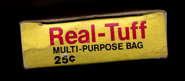
Just in from Cory Grove, a weiner dog with a big hot dog inside it, and a some nice packaging from a laundry mat somewhere. I remember doing my laundry on Sunday mornings in Bend. I’d ride my bike over from our little chicken coop on Staats with a load on my back. It was the saddest place in town. Kids were screaming, moms were crying, old men looked disoriented, and so on. Hmmm. Got my own washer and dryer these days. Progress. - - - - We make magazines for snowboarders. Very proud of all of these covers. Three years down. - - - - Required viewing: Santana at Woodstock, with careful attention to the drumming of a very young and very awesome Mike Shrieve. He was 18 at the time, in front of all those people. Wow. I watched this movie really late at the Hard Rock Hotel in Vegas last week. The whole thing. So good. I love the grainy color. - - - - Faz turned me onto Rogue Wave. Thanks, man. - - - - Samuel Bebbington, on the other side of the pond. - - - - Miss Amy Jo, of Minneapolis. There is One Comment
Nice posters from Miss Amy Jo, I dig ‘em. Of course Ryno will probably weigh in to say that everyone who does screenprinted posters (including Aesthetic Apparatus, The Bird Machine, and the scores of others who have jumped on this bandwagon in recent years) is overrated and that their stuff is low on concept and really isn’t that good, but I think that for the most part they make very good-looking and effective posters and I’d like to have most of ‘em on my wall. ps- your “snowboarding magazines” link was to a private, friends-only Myspace page, couldn’t see it. Posted by: PJ Chmiel on 02/07/07 at 5:48 AM
Post a Comment
(you may use HTML tags for style)
Remember Me?
|


