July 31, 2006
Posted at 08:20 AM
Comments (3)

|
July 31, 2006
Posted at 08:20 AM
Comments (3)
|
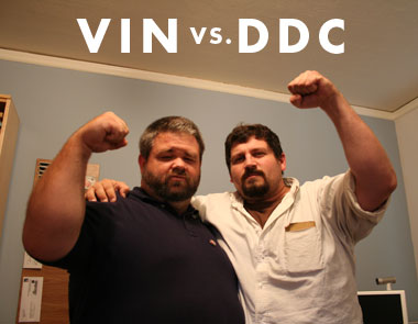
Not to be fucked with: Vin vs. DDC. So good. Vin’s forearm alone could move a mountain. - - - - My Seattle mission on Thursday/Friday was quick and dirty. The traffic all the way there, and back, disgusted me so much I’ve just now able to think about it all. Here some images from the whirlwind tour. 01. “Savoring the smooth sailing of I-5.” Awhile back I did a logo for Nemodesign for the Hotel Max up in Seattle. (Nice site!) Well, hell, they used it, and man, we had to do a quick pitstop to pick Coal teamrider Priscilla Levac there on the way to the photoshoot. So cool. 03. “Priscilla Levac and Embry getting to know eachother, possibly discussing photo ideas. Maybe not.” Seattle has great neighborhoods. We did most fo the shoot in the Ballard district. I dig. Great old buildings and llittle shops and brick streets. 08. “Seattle: home of square tree trunks. Special thanks to Brad for arranging things, to Priscilla and Jessica for being beautiful and to Embry for getting it all on film. So good. Stay tuned for a sneek peek. - - - - Took a lot of time off this weekend, and still managed to get a ton done. Wow. Rounded off the weeked doing this shit: 01. Watching War Of The Worlds in HDTV on HBO.
There Are 3 Comments
The Hotel Max logo is super clean, modern and nice. Nothing too baroque or too much. Less is more indeed. Gotta be nice to see your handiwork in real space. Posted by: Naz on 07/31/06 at 7:24 AM
We share Burrito Power! Posted by: Vince on 08/01/06 at 10:50 AM
the max logo: sophisticated. simple. balanced. modern. not 1986”max” vernacular. Posted by: haker on 08/02/06 at 7:20 AM
Post a Comment
(you may use HTML tags for style)
Remember Me?
|
| This tale best unfolds in Firefox, Chrome or Safari, man. Designed by the Draplin Design Co. |
Published daily. We guaarontee everything |
©1998-2019 Draplin Design Co. All content by Aaron James Draplin. |